Brochures Evolution
 Blog07.02.2023
A brochure like any other graphic piece, is not an art piece where the artist has a wave of creativity and paints a picture. A graphic piece is developed to solve problems.
For example:
- What is the target?
- What is the intention?
- What message do we want to get across?
There is a lot of study behind a brochure, there is an exchange of ideas and many attempts at different layouts.
Over time Micronclean has changed the way it presents itself to the world, first we had brochures full of images and an accentuated use of bold fonts.
That was the time that we were presenting ourselves to the world, we needed to show and make ourselves heard visually. If our brochures had sound, they would certainly shout:

Over time and with the consolidation of the Micronclean brand we started to have less need to scream, and we started to visually talk to our customers through pages where white is the King and simplicity is the Queen.
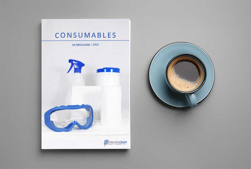
Currently our main concern is to focus on one product each time, each product is entitled to a page, because that is how we want our customers to see our range of products, a product each time, divided by families and utility. When browsing our brochures we intend to create the same experience that the customer has when choosing a computer or mobile phone, no product shares the same page with another product, each one has its moment of glory with high resolution photographs and without other graphic elements to distract the customer.
When I am working on a new brochure, I like to mentally visualize how the customers will look at the brochure, how they leaf through it, how they feel each product. In my imagination the customer is always in the company of a good coffee while opening the brochure and starts leafing page by page, product by product, making notes on the most interesting pages, what can be done without worrying about writing on top of some printed information, as there is a lot of white space on all pages, where small notes can be made or post-it notes.

For the time being we will keep in a minimalist style and continue to give prominence to the product, but I can predict that in the future we will turn our brochures into graphic pieces focused on the details and specifications of each product and service. Perhaps the empty spaces will be filled with technical information, but this is all part of the evolution of the company…
The bigger we are, the better informed we have to make our customers.

Author
Cristiana Salgueiro
Graphic Designer
